|
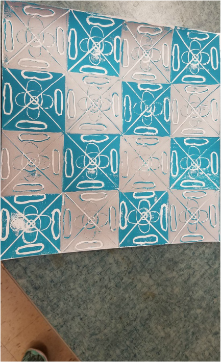
Title: Blue and Silver Checkerboard
Course: 7th grade art Teacher: Mrs. Powers Subject matter: Printmaking Medium: Paint Project Goal: To successfully print paint on a piece of paper. I planned my Printmaking project by basing it off of my oil-pastel design. I really wanted to create a unique design for the stamp. The elements that I used to make this were color, texture, and form. The principals are, pattern, contrast, and balance. I really liked that I could use more than one color to do this project. I fell that it has more contrast and texture than just one color. My strength on this project was carving the rubber piece, but my weakness was getting the rubber piece on straight. I think I could've used a ruler to map out where each stamp would go. If we do this project again, I hope that i will do better. |
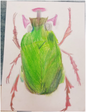
Title: Fred the Bug
Course: 7th grade art
Teacher Mrs. Powers
Subject Matter: Insect
Medium: colored pencil
Project goal: Use colored pencils to make create a texture for your insect
I used a picture of a bug that looked a lot like the one I drew to create a design. I switched the color from purple to green. I feel that this is a more insect color. The ingredients that I used (elements of design) were color, texture, value, and contrast. The principals that I used were balance and movement.
What I liked about the project is how I got to design something that we mostly see everyday. What I didn't like about this project was that we could only use colored pencils, I think this would've looked really cool if we could've used pastels. The thing that I could've done better in this project was to blend colors that don't look alike. I blended a bunch of light greens together to make an ugly green. If I had to do this project over again, I would do this.
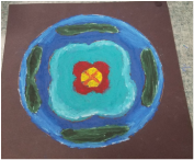
Title: Ocean Islands
Course: 7th grade art
Teacher: Mrs. Powers
Subject matter: Islands in an ocean
Medium: Oil Pastel
Project goal: create a cool design, using oil pastels
I designed Ocean Islands this was because I wanted this to be a tropical island Oil Pastel project. I used color, texture, value, shape, and color to make this. The principals I used were pattern and rhythm. I blended many blues and grays to make lighter and darker blues for the ocean. I felt that if I have a lighter blue around the island, it will look like it is a sandbar.
What I really liked about this project is that I got to use oil pastel. I like using oil pastels because I can blend the colors to make different shades of color. What I didn't about this project is that we had to make it symmetrical on all sides. I didn't like this because you can have a lot more detail if you have different shapes. I think I could've blended the green color more. What I did well was creating a symmetrical shape. If I do this project over again, I will make sure to do these things.
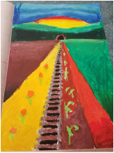
Title: A day on the farm
Course: 7th grade art
Teacher: Mrs. Powers
Subject Matter: A rural area
Medium: oil pastel
Project Goal: Create a rural area using 1-point perspective
I designed A Day on the Farm using 1-point perspective. I wanted to show what I have seen in a rural area, so I put train tracks going to the point. I thought this would make the area look more rustic because trains are not used as much now. The elements I used are line, value, space and color. The principals are contrast, movement, and balance.
What I liked about this project is that we could put really anything that is in a rural area in the picture as long as it went to the point. This was cool because we didn't really have any restrictions. What I didn't like in this picture was that we could only go to the one point. I didn't like this because I felt that I could've done more things, if they didn't have to go to the point. My strengths in this project were blending the colors together. My weakness was that I could only draw things going to the point. If I ever do this project again, I will make sure to do these things.
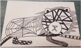
Title: Laying Lion
Course: 7th grade art
Teacher: Mrs. Powers
Subject matter: A lion laying down
Medium: Sharpie
Project goal: Create an animal using zentangle
I designed this by looking at different examples of zentangle animals. I wanted to show how the zentangles for smaller places could be used in bigger places too, like the spider web opn the back of the lion, or the black lines on it's face. I used line, space, and shape to create this project. I also used pattern, contrast, and space to make this zentangle lion.
What I liked about this project was that I got to use different types of zentangles to create this. What I didn't like was that I didn't like about this project is that I couldn't add color to the white spots. I feel that if I did this project again, I would try to write lighter wit pencil so it doesn't show through the sharpie.
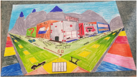
Title: Monopoly town
Course: 7th grade art
Teacher: Mrs. Powers
Subject Matter: A town
Medium: Oil Pastel
Project goal: Create a city using 2-point perspective
I designed this by looking up pictures on google of a Monopoly board and trying to make that into a town. I wanted to show that I could crate many -things using 2-point perspective like the road lines and sidewalks, but still sticking to theme. I used line, shape, and space to create this city. I also used pattern, balance and movement.
What I liked about this project was that I got to choose my own theme to make the city/town. I really liked this project, but I didn't like that we had to use oil pastel. I feel that I could've used colored pencils to make this project. If I did this project over, I would make sure to blend more colors to make it look more realistic.
Title: Mug with face
Course: 7th grade art
Teacher: Mrs. Powers
Subject Matter: A mug with a face
Meduim: Clay
Project Goal: Create a mug with a face on it
I designed this mug by trying to find the perfect face. I searched Google and looked at other examples, but finally found the perfect one. It was a little hard to form the mug with my clay because it was a little dry. I used shape, value, and texture create this mug. I really liked desining this mug because I could make it any way I wanted to.
What I really liked about this project, is that we could make the face whatever we wanted it to be. What I didn't like about this project was that we had to make it round. I could've made a different face using a square mug. Next time I do this project, I hope that I can make a square mug, and I will make sure I score and slip everything very well.

Title: Donkey Day
Course: 7th grade art
Teacher: Mrs. Powers
Subject: A donkey on a prarie
Medium: Water colors
Project goal: Create a realistic looking animal using water colors
I designed this piece by looking at a picture of a donkey and basically trying to takw the shape of it and put it on paper. I used color, value, and space to make this donkey. I used color by using different amounts of water for the colors to make it lighter and darker.
What I liked about this project was that we had a wide range of animals and colors to use/ choose from. What I didn't like is that we had to do this as an animal. I would really like if we could use water colors wile creating a landscape or a natural feature. If I didn this project again, I would try to something different than an animal, and I will try to add more texture on the face or main part of the object.
